
1. 선형회귀로 분류도 가능할까?
이전 장까지해서 회귀모델에 대해 알아봤다. 주로 수치형 변수들을 사용해 특정 목표 변수의 값을 예측하는 문제를 많이 풀어봤는데, 현실에서는 특정 수치를 예측하는 문제도 있지만, 어떤 분류에 속하냐와 같이 분류와 관련된 문제들도 존재한다. 그렇다면, 지금까지 배운 회귀모델을 사용해 분류에 대한 문제도 해결할 수 있을까?
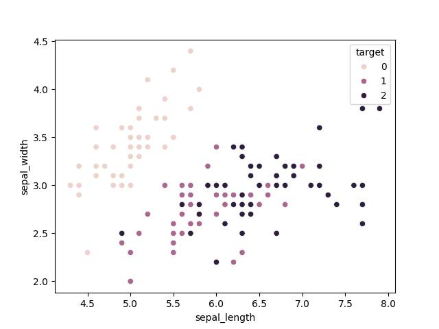
이를 위해 분류문제로 대표적인 아이리스 데이터 셋을 사용해 회귀모델을 사용해 분류해보자. 아는 사람들은 알겠지만 아이리스 데이터 셋은 꽃잎의 크기와 길이 등을 사용해 해당 꽃이 Setosa, Versicolor, Virginica 중 하나로 분류하는 것을 목표로 한다. 구체적인 데이터는 아래 예시를 통해서 살펴보자.
import numpy as np
import pandas as pd

import matplotlib
from matplotlib import pyplot as plt
import seaborn as sns

from sklearn.datasets import load_iris

matplotlib.use("qtagg")

iris = load_iris()
features = pd.DataFrame(iris["data"], columns=["sepal_length", "sepal_width", "petal_length", "petal_width"])
targets = pd.DataFrame(iris["target"], columns=["species"])

data = pd.concat([features, targets], axis=1)

# 데이터 분포 시각화
sns.scatterplot(x="sepal_length", y="sepal_width", data=data, hue="species", legend="full")
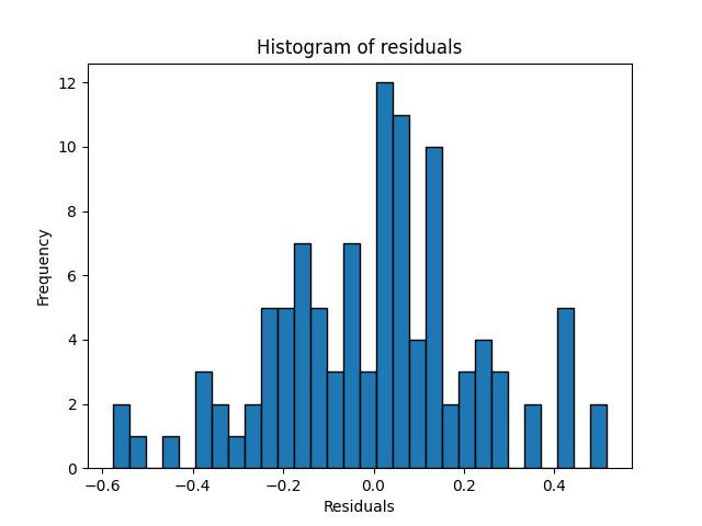
이제 선형회귀 모델을 사용해서 분류를 한번 해보도록 하자. 사용할 모델은 앞서 회귀에서 다뤘던 statsmodel.api 에 있는 OLS() 를 사용하였다. 코드는 파이썬으로만 살펴볼 예정이며, 결과는 다음과 같다.
x_train, x_test, y_train, y_test = train_test_split(features.to_numpy(), targets.to_numpy(), \
                                                    test_size=0.3, random_state=42)

model = sm.OLS(y_train, x_train).fit()
print(model.summary())

# 잔차 계산
residuals = model.resid

# 잔차 그래프 그리기
plt.figure(figsize=(10, 6))
plt.scatter(model.fittedvalues, residuals)
plt.axhline(0, color='red', linestyle='--')
plt.xlabel('Fitted values')
plt.ylabel('Residuals')
plt.title('Residuals vs Fitted values')
plt.show()

# 잔차의 정규성 검토 - Q-Q plot
sm.qqplot(residuals, line='45')
plt.title('Q-Q plot of residuals')
plt.show()

# 잔차의 히스토그램
plt.hist(residuals, bins=30, edgecolor='k')
plt.xlabel('Residuals')
plt.ylabel('Frequency')
plt.title('Histogram of residuals')
plt.show()

# 잔차의 통계 요약
print(f'Residuals mean: {np.mean(residuals):.4f}')
print(f'Residuals variance: {np.var(residuals):.4f}')

[실행결과]
                                 OLS Regression Results
=======================================================================================
Dep. Variable:                      y   R-squared (uncentered):                   0.971
Model:                            OLS   Adj. R-squared (uncentered):              0.970
Method:                 Least Squares   F-statistic:                              851.9
Date:                Sun, 23 Jun 2024   Prob (F-statistic):                    7.72e-77
Time:                        22:55:29   Log-Likelihood:                          7.5399
No. Observations:                 105   AIC:                                     -7.080
Df Residuals:                     101   BIC:                                      3.536
Df Model:                           4
Covariance Type:            nonrobust
==============================================================================
                 coef    std err          t      P>|t|      [0.025      0.975]
------------------------------------------------------------------------------
x1            -0.0809      0.062     -1.312      0.193      -0.203       0.041
x2            -0.0413      0.072     -0.578      0.565      -0.183       0.101
x3             0.2598      0.072      3.608      0.000       0.117       0.403
x4             0.5224      0.118      4.417      0.000       0.288       0.757
==============================================================================
Omnibus:                        0.460   Durbin-Watson:                   2.005
Prob(Omnibus):                  0.795   Jarque-Bera (JB):                0.253
Skew:                          -0.117   Prob(JB):                        0.881
Kurtosis:                       3.056   Cond. No.                         52.3
==============================================================================
Notes:
[1] R² is computed without centering (uncentered) since the model does not contain a constant.
[2] Standard Errors assume that the covariance matrix of the errors is correctly specified.

Residuals mean: 0.0015
Residuals variance: 0.0507# 훈련 데이터와 테스트 데이터로 분할
set.seed(42)
split <- sample.split(iris$Species, SplitRatio = 0.7)
train_data <- subset(iris, split == TRUE)
test_data <- subset(iris, split == FALSE)
# 선형 회귀 모델 적합
model <- lm(Species ~ Sepal.Length + Sepal.Width + Petal.Length + Petal.Width, data = train_data)
summary(model)
# 잔차 계산
residuals <- residuals(model)
# 잔차 그래프 그리기
ggplot(data = data.frame(fitted = fitted(model), residuals = residuals), aes(x = fitted, y = residuals)) +
geom_point() +
geom_hline(yintercept = 0, color = 'red', linetype = 'dashed') +
labs(x = 'Fitted values', y = 'Residuals', title = 'Residuals vs Fitted values') +
# 잔차의 정규성 검토 - Q-Q plot
qqPlot(residuals, main = "Q-Q plot of residuals")
dev.off()
# 잔차의 히스토그램
ggplot(data = data.frame(residuals = residuals), aes(x = residuals)) +
geom_histogram(bins = 30, color = 'black', fill = 'white') +
labs(x = 'Residuals', y = 'Frequency', title = 'Histogram of residuals') +
# 잔차의 통계 요약
cat(sprintf("Residuals mean: %.4f\n", mean(residuals)))
cat(sprintf("Residuals variance: %.4f\n", var(residuals)))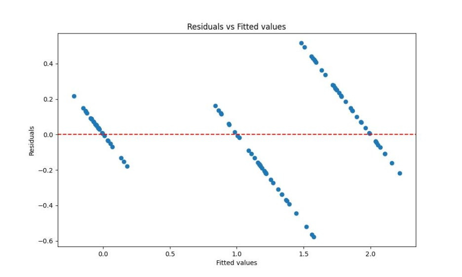
2. 로지스틱 회귀
위의 결과들만 놓고 보자면, 회귀 모형으로는 분류 문제를 풀 수 없는 것인가라는 문제가 남는다. 이에 대해 1958년 영국의 통계학자인 D.R.Cox 는 독립변수들의 선형 결합을 이용해 사건의 발생 가능성을 예측하는 통계 기법으로, 일반화 선형모형(Generalized Linear Model) 의 특수한 경우라고 볼 수 있다.
일반화 선형모형은 앞서 기본적인 회귀모형의 가정인 독립성, 정규성, 등분산성, 선형성을 지키지 못하는 경우에 사용하는 선형 모형을 의미한다. 대표적인 예시로는 종속변수가 정규분포를 따르지 않는 경우나 범주형 변수인 경우가 있다. 이 경우, 기존 회귀 모델에 링크 함수를 추가함으로써 일반 선형 모델로 확장할 수 있는데, 로지스틱 회귀의 경우에는 링크 함수를 Logit 함수로 채택한 선형회귀모델을 말한다. ]쉽게 말해 Logit 함수를 사용한 합성함수 라고 표현할 수 있겠다.
2.1 Logit 함수란?
그렇다면 로짓 함수는 무엇일까? 이에 대한 답을 하기 위해서는 먼저, 로짓 함수가 등장하게 된 배경부터 설명해야한다. 앞서 로지스틱 회귀를 적용하는 이유는 범주형 종속변수를 분류하기 위해서이고, 독립변수들의 선형 결합을 이용해 사건의 발생 가능성, 즉 확률 값을 예측한다고 했다. 따라서 분류를 하기 위해 확률값을 사용할 것이므로, 단순이 0 또는 1과 같이 특정 값이 아니라 0~1 사이에 들어갈 확률값을 예측하는 것이다. 예를 들어, 2개의 클래스로 분류해야하는 문제라고 가정해보자. 이에 대한 확률 값은 이항분포를 따를 것이며, 우리가 궁금한 것은 독립변수 X에 대한 확률값일 것이다. 이를 수식으로 표현하자면 다음과 같다.
그리고 이를 계산하기 위한 회귀식을 표현하자면 아래와 같을 것이다.
하지만 여기에는 문제가 하나 있다. 종속 변수 값의 범위는 0~1 이지만, 독립변수의 경우에는 -∞ ~ ∞ 이며, 일반 선형 식으로 표현됐을 때 항상 확률 값이 0 ~ 1 사이의 값이 아닐 수 있기 때문이다. 때문에 종속변수 값의 범위를 -∞ ~ ∞ 로 변환하여 식을 성립하자는 개념이 등장한다. 이를 위해 등장한 계념이 바로 Odds 와 Logit 함수인 것이다.
Odds 란, 간단하게 말하면, 성공확률/실패확률을 의미한다. 그리고 Logit 함수는 Odds 에 log를 취한 함수라고 할 수 있다. 이를 통해 종속변수가 어떻게 바뀌는 지는 아래 수식을 통해 살펴볼 수 있다.
위의 수식에서처럼 Odds 값은 확률 p 가 1에 가까워질수록 분모는 0에 가까워지므로 무한대로 갈 것이다. 그리고 Logit 은 Odds 에 log를 취한 것이라고 했으므로, 범위는 -∞ ~ ∞ 로 변하게 되는 것이다. 위의 내용을 아까의 회귀식에 반영해보면 아래와 같은 결과를 얻을 수 있다.
우리가 원하는 결과값은 확률값(p) 이라고 했으므로, 위의 수식을 p 에 대하여 정리를 해주면 다음과 같은 결과가 나온다.
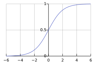
결과적으로, 우리가 원하는 회귀식을 logit 함수를 이용해 계산할 수 있었으며, 그의 결과로 확률값을 구할 수 있게되었다. 이를 그래프로 표현하자면, 다음과 같은 그래프를 얻을 것이다.
2.2 로지스틱 회귀의 최적값을 구하려면?
2.2.1 최대 가능도 방법 (Maximum Likelihood Estimation)
위의 그래프처럼 로지스틱 함수는 입력값과 평균값 사이에 다음과 같은 관계가 존재한다.
[로지스틱 함수의 입력값-평균의 관계]
입력값 = 0 일 때, 평균 = 0.5
입력값 > 0 일 때, 평균 > 0.5 이므로 출력값 = 1
입력값 < 0 일 때, 평균 < 0.5 이므로 출력값 = 0
즉, 입력 값이 분류 모형의 판별함수로 역할한다는 것이다. 로지스틱 회귀분석에서는 판별함수 수식으로 아래의 선형함수가 사용되며, 판별 경계면도 선형이 된다.
앞서 우리는 선형회귀 모델에서 최적의 값을 찾기 위해, 각 변수별로 최적의 가중치를 찾아, 최적회귀방정식을 계산하였고, 데이터에 대한 모수를 찾을 수 있었다. 그렇다면, 로지스틱 회귀모델에서는 어떻게 최적의 모수(w) 를 찾을 수 있을까?
로지스틱 회귀의 경우에는 최대가능도 방법 또는 최대우도법(MLE, Maximum Likelihood Estimation)을 이용한다. 이는 표본 x 로부터 우리가 알고자 하는 모수를 추정할 때, 확률분포에서 x가 발생하는 파라미터의 가능성을 최대로 만드는 방법이라고 설명할 수 있다. 즉, x 가 변수가 아닌 상수로 고정된 값이고, 이를 변화시키는 파라미터의 가능성 중 최대값을 만드는 파라미터를 찾는다고 볼 수 있다. 이를 식으로 표현하면 다음과 같다.
위의 수식에서 p 는 로지스틱 모형의 결과값인 확률값, y 는 종속변수의 관측치를 의미한다. 하지만, 이 식으로 항상 최적의 해를 찾는다는 보장이 없으며, 이를 위한 방법 중 하나로 최적화 알고리즘인 경사하강법 (Gradient Descent) 를 활용해볼 수 있다.
경사하강법에서 가장 중요한 것은 어떤 것을 비용함수로 선정하는 가이며, 일반적인 선형회귀에서는 주로 MSE(Mean Squared Error) 값을 비용함수로 사용해 편미분한 결과가 0이되는 최적해를 찾는 방식이다. 하지만, 로지스틱회귀에서는 선형회귀와 동일하게 MSE 로 비용함수를 선정할 수 없다. 이유는 변곡점이 많을 수 있으며, 이럴 경우 아래 수식과 같이 단순화를 시켜야하는 작업이 필요하다.
앞서 입력값에 따라 출력값이 바뀌는 것을 확인했으며, 위의 수식 2개를 합치게 되면 최종적인 비용함수가 나오게 된다. 식은 다음과 같다.
2.2.2 계수해석
위의 방식을 통해 회귀계수가 나온다면 이를 해석해야 하는데, 로지스틱 회귀에서는 회귀계수에 exp 를 취함으로써 승산비로 회귀계수를 해석한다. 예를 들어, 회귀 계수가 0.6이라면, 변수의 값이 1 증가할 때마다 exp(0.6) 배만큼 증가하는 것이다. 해당 변수에 대한 성공확률이 50% 라고 가정하면, Odds 값은 1이 된다. 이 상황에서 변수의 값이 1 증가하면, exp(0.6)=1.8 배 만큼 증가하게 되고, Odds 값이 1.8이므로 아래 식과 같이 최종적인 확률값을 계산해보면, 성공확률은 0.64가 될 것이다.
결과적으로 추정된 회귀계수에 exp 를 취함으로서 독립변수의 영향력을 파악하고 해석할 수 있게 된다.
2.3 실습: 로지스틱 회귀
이제 마지막으로 앞서 본 iris 데이터셋을 로지스틱 회귀모델을 사용해 분류해보도록 하자. 추가적으로 사용할 변수는 꽃잎의 너비(Petal Width)를 사용하며, 분류해야되는 클래스가 2개 이상이기 때문에 Virginica 종인지 아닌지의 여부로 바꿔서 진행해보자. 구체적인 코드는 다음과 같다.
import numpy as np
import pandas as pd

import matplotlib
from matplotlib import pyplot as plt

from sklearn.datasets import load_iris
from sklearn.linear_model import LogisticRegression

matplotlib.use("qtagg")

iris = load_iris()

x = iris['data'][:,3:]
y = (iris['target']==2).astype(np.int32)

model = LogisticRegression(solver='liblinear', random_state=42)
model.fit(x, y)

x_n = np.linspace(0,3,100).reshape(-1,1)
y_pred = model.predict_proba(x_n)
y_pred

decision_boundary = x_n[y_pred[:,1]>=0.5][0]
print("Decision Boundary: " + str(decision_boundary[0]))

plt.figure(figsize=(8,3))
plt.plot(x[y==0],y[y==0],'bs')
plt.plot(x[y==1],y[y==1],'g^')
plt.plot([decision_boundary, decision_boundary],[-1,2],'k:',linewidth=2)
plt.plot(x_n, y_pred[:, 1], 'g-', linewidth=2, label='Iris-Virginica')
plt.plot(x_n, y_pred[:, 0], 'b--', linewidth=2, label='Not Iris-Virginica')
plt.text(decision_boundary[0]+0.02, 0.15, 'Decision Boundary', fontsize=14, color='k', ha='center')
plt.arrow(decision_boundary[0], 0.08, -0.3, 0, head_width=0.05, head_length=0.1, fc='b', ec='b')
plt.arrow(decision_boundary[0], 0.92, 0.3, 0, head_width=0.05, head_length=0.1, fc='g', ec='g')
plt.xlabel('petal width(cm)', fontsize=14)
plt.xlabel('probability        ', fontsize=14, rotation=0)
plt.legend(loc='center left', fontsize=14)
plt.axis([0,3,-0.02,1.02])
plt.show()

[실행결과]
Decision Boundary: 1.6363636363636365# 데이터 준비
x <- iris$Petal.Width
y <- as.integer(iris$Species == "virginica")
# 로지스틱 회귀 모델 적합
model <- glm(y ~ x, family = binomial)
# 새로운 데이터 생성
x_n <- seq(0, 3, length.out = 100)
y_pred <- predict(model, newdata = data.frame(x = x_n), type = "response")
# 결정 경계 계산
decision_boundary <- x_n[min(which(y_pred >= 0.5))]
print(paste("Decision Boundary:", decision_boundary))
# 데이터 및 예측값 시각화
plot_data <- data.frame(x = x, y = y)
plot_pred <- data.frame(x = x_n, y_pred = y_pred)
ggplot() +
geom_point(data = plot_data, aes(x = x, y = y), color = ifelse(plot_data$y == 0, 'blue', 'green')) +
geom_vline(xintercept = decision_boundary, linetype = "dotted", color = "black", size = 1) +
geom_line(data = plot_pred, aes(x = x, y = y_pred), color = "green", size = 1) +
geom_line(data = plot_pred, aes(x = x, y = 1 - y_pred), linetype = "dashed", color = "blue", size = 1) +
annotate("text", x = decision_boundary + 0.02, y = 0.15, label = "Decision Boundary", color = "black", size = 5, hjust = 0) +
annotate("segment", x = decision_boundary, xend = decision_boundary - 0.3, y = 0.08, yend = 0.08, arrow = arrow(type = "closed", length = unit(0.1, "inches")), color = "blue") +
annotate("segment", x = decision_boundary, xend = decision_boundary + 0.3, y = 0.92, yend = 0.92, arrow = arrow(type = "closed", length = unit(0.1, "inches")), color = "green") +
labs(x = "Petal Width (cm)", y = "Probability") +
theme_minimal()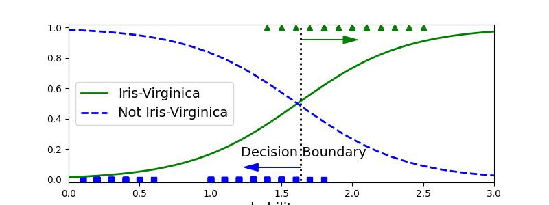
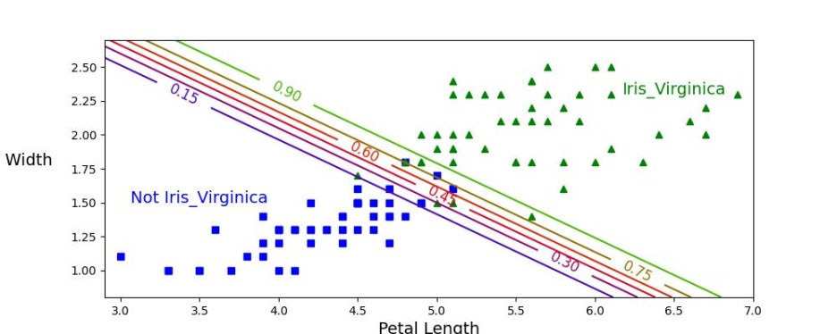
위의 그래프를 보면 알 수 있듯이 2개 그래프 모두 약 1.64 cm 에서 결정경계가 만들어지는 것을 확인할 수 있다. 따라서 값이 1.64를 기준으로 큰 경우에 Iris-Virginica 로 분류하고, 작으면 아니라고 예측할 것이다. 끝으로 아래 판별 모델을 생성해보고 실제로도 결정경계에서 데이터가 잘 분류되는지 확인해보도록 하자.
X = iris['data'][: , (2, 3)]
y = (iris['target'] == 2).astype(np.int32)

log_reg = LogisticRegression(solver='liblinear', C=10**10, random_state=42)
log_reg.fit(X,y)

x0, x1 = np.meshgrid(
                np.linspace(2.9, 7, 500).reshape(-1,1),
                np.linspace(0.8, 2.7, 200).reshape(-1,1),
                )
X_n = np.c_[x0.ravel(), x1.ravel()]
y_p = log_reg.predict_proba(X_n)

plt.figure(figsize=(10,4))
plt.plot(X[y==0, 0], X[y==0, 1], 'bs')
plt.plot(X[y==1, 0], X[y==1, 1], 'g^')

zz = y_p[:, 1].reshape(x0.shape)
contour = plt.contour(x0, x1, zz, cmap=plt.cm.brg)

left_right = np.array([2.9, 7])
boundary = -(log_reg.coef_[0][0] * left_right + log_reg.intercept_[0] / log_reg.coef_[0][1])

plt.clabel(contour, inline=1, fontsize=12)
plt.plot(left_right, boundary, 'k--', linewidth=3)
plt.text(3.5, 1.5, 'Not Iris_Virginica', fontsize=14, color='b', ha='center')
plt.text(6.5, 2.3, 'Iris_Virginica', fontsize=14, color='g', ha='center')
plt.xlabel('Petal Length', fontsize=14)
plt.ylabel('Petal Width                       ', fontsize=14, rotation=0)
plt.axis([2.9, 7, 0.8, 2.7])
plt.show()# iris 데이터셋 로드
data(iris)
# 데이터 준비
X <- iris[, c("Petal.Length", "Petal.Width")]
y <- as.integer(iris$Species == "virginica")
# 로지스틱 회귀 모델 적합
log_reg <- glm(y ~ Petal.Length + Petal.Width, data = iris, family = binomial)
# 그리드 데이터 생성
x0 <- seq(2.9, 7, length.out = 500)
x1 <- seq(0.8, 2.7, length.out = 200)
grid <- expand.grid(Petal.Length = x0, Petal.Width = x1)
y_p <- predict(log_reg, newdata = grid, type = "response")
# 예측값을 그리드 형식으로 변환
zz <- matrix(y_p, nrow = length(x0), ncol = length(x1))
# 결정 경계 계산
left_right <- c(2.9, 7)
boundary <- -(coef(log_reg)["Petal.Length"] * left_right + coef(log_reg)["(Intercept)"]) / coef(log_reg)["Petal.Width"]
# 시각화
plot_data <- data.frame(Petal.Length = X$Petal.Length, Petal.Width = X$Petal.Width, y = y)
ggplot() +
geom_point(data = plot_data[plot_data$y == 0, ], aes(x = Petal.Length, y = Petal.Width), color = 'blue', shape = 15) +
geom_point(data = plot_data[plot_data$y == 1, ], aes(x = Petal.Length, y = Petal.Width), color = 'green', shape = 17) +
stat_contour(data = data.frame(Petal.Length = rep(x0, each = length(x1)), Petal.Width = rep(x1, length(x0)), zz = c(zz)),
aes(x = Petal.Length, y = Petal.Width, z = zz), bins = 1, color = 'black', linetype = "dashed") +
geom_abline(intercept = boundary[1], slope = boundary[2], linetype = "dashed", color = "black", size = 1) +
annotate("text", x = 3.5, y = 1.5, label = "Not Iris-Virginica", color = "blue", size = 5, hjust = 0.5) +
annotate("text", x = 6.5, y = 2.3, label = "Iris-Virginica", color = "green", size = 5, hjust = 0.5) +
labs(x = "Petal Length", y = "Petal Width") +
theme_minimal()
여기까지, 로지스틱 회귀이자, 통계분석 기법들에 대한 기본적인 내용들을 다뤄보았다. 이 다음부터는 본격적으로 머신러닝 모델들과 다양한 전처리 기법들에 대해서 설명할 예정이며, 중간중간 통계 기법들에 대해서도 다뤄볼 예정이니 참고바란다.
'Data Science > 데이터 분석 📊' 카테고리의 다른 글
| [데이터 분석] 14. 서포트 벡터 머신 (SVM) (0) | 2024.08.08 |
|---|---|
| [데이터 분석] 13. 최근접 이웃(k Nearest Neighbor) (1) | 2024.08.04 |
| [데이터 분석] 11. 회귀Ⅱ: 규제 (0) | 2024.08.01 |
| [데이터분석] 10. 회귀Ⅰ: 선형회귀 (0) | 2024.08.01 |
| [데이터 분석] 9. 통계분석Ⅳ: 추정 & 가설검정 - 실습편 (0) | 2024.08.01 |